Above the Fold That Works: Design a Homepage Top Section That Converts
Above the Fold That Works: Design a Homepage Top Section That Converts
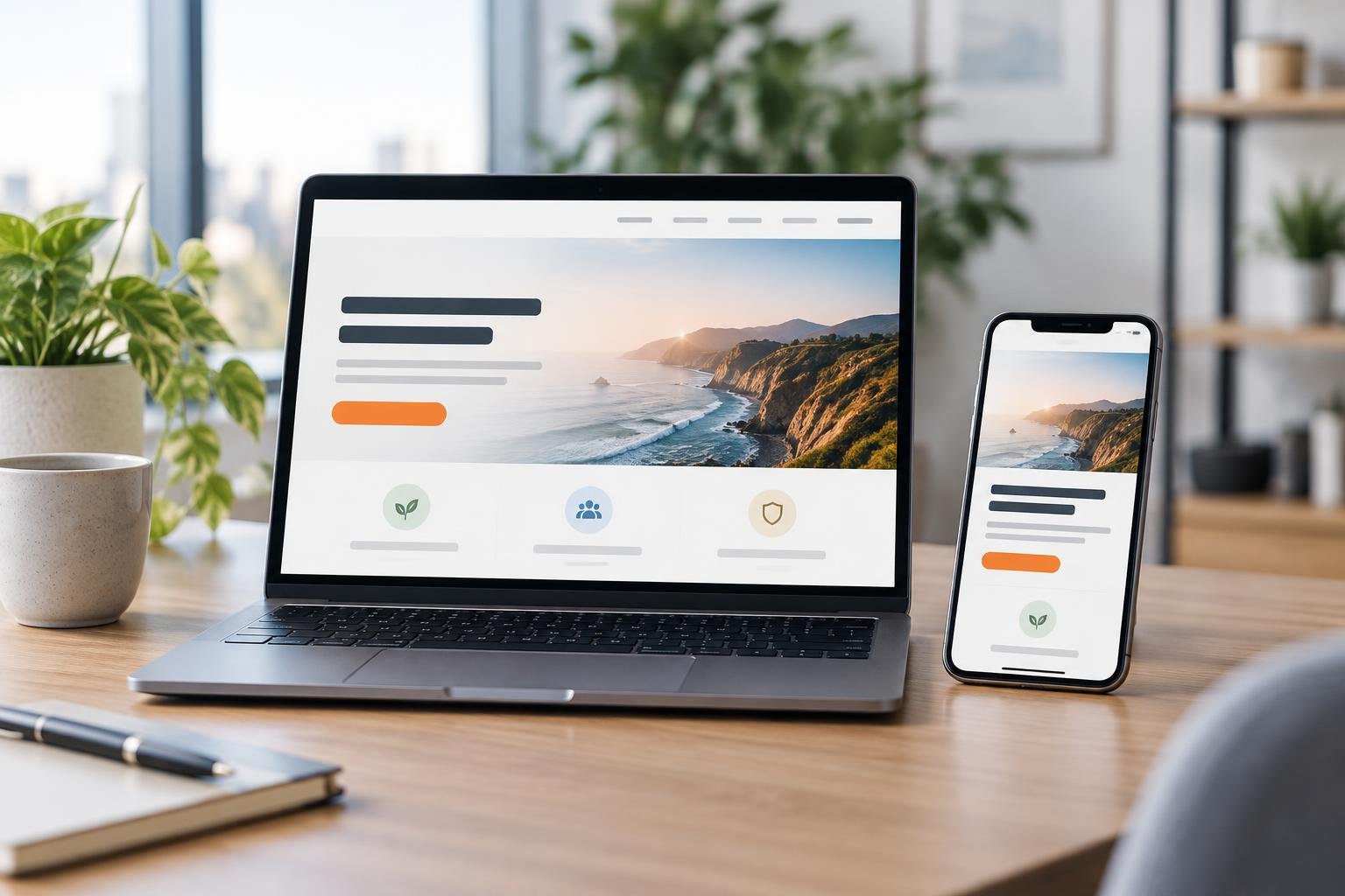
The first screen of your homepage is like the front window of a store. In a few seconds, people decide: “Am I in the right place?” and “Should I go in or walk away?” Online, that first screen is called the area above the fold—what visitors see before they scroll.
If that top section is cluttered, vague, or trying to do too many things, visitors bounce. If it’s clear, focused, and reassuring, they stay, explore, and eventually become customers. This guide walks you step by step through designing an above-the-fold hero section that actually converts—using a simple headline formula, one primary call-to-action, supportive visuals, trust cues, and mobile-first layout tips.
What “Above the Fold” Really Means (and Why It Matters)
“Above the fold” originally came from newspapers: the headlines and photos visible on the top half of the front page when the paper was folded. Those top stories were chosen carefully because they sold the paper.
On your website, above the fold is simply what someone sees immediately when your homepage loads—before they scroll. This slice of screen time matters because:
- Visitors take only 3–5 seconds to decide whether to stay or leave.
- Most people skim; they won’t hunt around to figure out what you do.
- First impressions shape how trustworthy and professional you seem.
So, your goal is to answer three questions at a glance:
- What is this?
- Is it for me?
- What should I do next?
Start With a Clear, Customer-Focused Headline
Your headline is the single most important element above the fold. It should tell visitors in plain language what you offer and who it’s for—no clever wordplay required.
A simple headline formula
Use this formula to keep your headline sharp and clear:
We help [type of customer] get [main benefit] with [your product or service].
Homepage headline formula
You don’t have to keep the exact wording, but cover those pieces: customer, benefit, and offer.
| Weak headline | Stronger version using the formula |
|---|---|
| Digital Magic | We help local restaurants get more online orders with simple, done-for-you websites. |
| Solutions for Everyone | We help busy freelancers save hours each week with automated appointment scheduling. |
| Design That Pops | We create conversion-focused Shopify stores for small e-commerce brands. |
Notice how the stronger versions are specific and concrete. A visitor can instantly say, “Yes, that’s me,” or “No, that’s not for me”—which is exactly what you want.
Support it with a short subheadline
Beneath your headline, add a one–two sentence subheadline that adds just a bit of helpful detail, such as how it works or what makes you different.
- Clarify the process: “Launch a professional site in days, not weeks, with our guided templates.”
- Mention your angle: “No coding, no jargon—just a friendly setup call and we do the rest.”
- Highlight a key outcome: “Increase booking rates and reduce back-and-forth emails.”
Choose One Primary Call-to-Action (CTA)
Once visitors understand what you offer, they need to know the next step. That’s your call-to-action: the main button or link you want them to click.
Pick a single main action
Above the fold, aim for one primary CTA. Too many choices create friction and confusion.
- Service business: “Book a free consultation”
- Online tool: “Start free trial”
- Local shop: “View services” or “Order online”
- Content site: “Get the free guide” or “Subscribe for tips”
You can have a quieter secondary link (“Learn more”) nearby, but the primary button should stand out clearly in color and size.
Make your button copy specific
Button text like “Submit” or “Click here” is vague. Use action phrases that describe what happens next:
- “Schedule my free call”
- “Get instant access”
- “See pricing options”
- “Build my site now”
One clear call-to-action beats five competing buttons every time.
Homepage conversion principle
Use Imagery That Supports (Not Distracts From) Your Message
Images grab attention, but they can also confuse visitors if they don’t relate to what you offer. Choose visuals that support your message.
Good hero image options
- A photo of your product being used in a real setting
- A friendly photo of you or your team (for services, coaching, consulting)
- A simple illustration showing the before/after or the process
- A clean screenshot of your app or dashboard
Avoid generic stock photos like people in suits shaking hands, or random nature scenes that don’t connect to your offer.
Keep the layout balanced
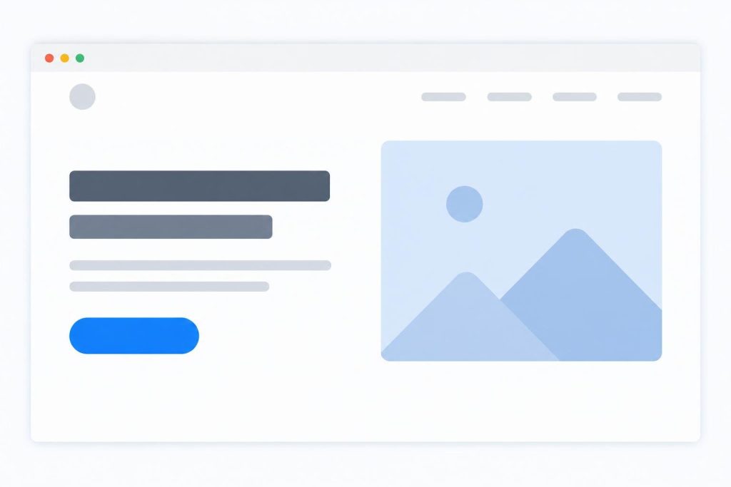
A common, effective layout is:
- Left side (or top on mobile): headline, subheadline, CTA button, trust cues
- Right side (or below on mobile): image that illustrates the benefit
The text should remain the star. If your image makes it hard to read the headline or buttons, simplify or darken/lighten the image behind the text.
Add Trust Cues Right Where They Count
Even if visitors like your offer, they still wonder, “Can I trust this?” You can answer that question right in your hero section with small, powerful trust cues.
- Customer review snippet with a name and result
- Logos of companies or publications you’ve worked with
- A short “as seen in” row (if relevant)
- A brief stat: “Trusted by 500+ small business owners”
- A small line of reassurance: “Cancel anytime” or “No credit card required”
You don’t need all of these at once. One or two well-placed trust signals next to your CTA are enough to ease doubts and encourage clicks.

Think Mobile-First: Design for the Smallest Screen
More than half of web traffic is on phones. If your hero looks great on desktop but cramped or confusing on mobile, you’re losing visitors.
Mobile layout priorities
On smaller screens, stack elements in this order:
- Headline (short enough to read without wrapping onto 5 lines)
- Subheadline (1–2 short sentences)
- Primary CTA button (large enough to tap easily)
- Key trust cue (a short testimonial or reassurance line)
- Supporting image (scaled down but still clear)
Test your site on your own phone. Is the headline readable at a glance? Is the button thumb-friendly? Do you have to zoom in to understand anything? If yes, simplify.
Checklist: Is your hero mobile-ready?
- Text size is large enough to read without zooming.
- There’s only one main button visible at first glance.
- No pop-ups cover your headline or CTA on load.
- Images resize instead of cutting off important parts.
- Load time is fast (lightweight images and hosting).
Before and After: Simple Wireframe Makeover
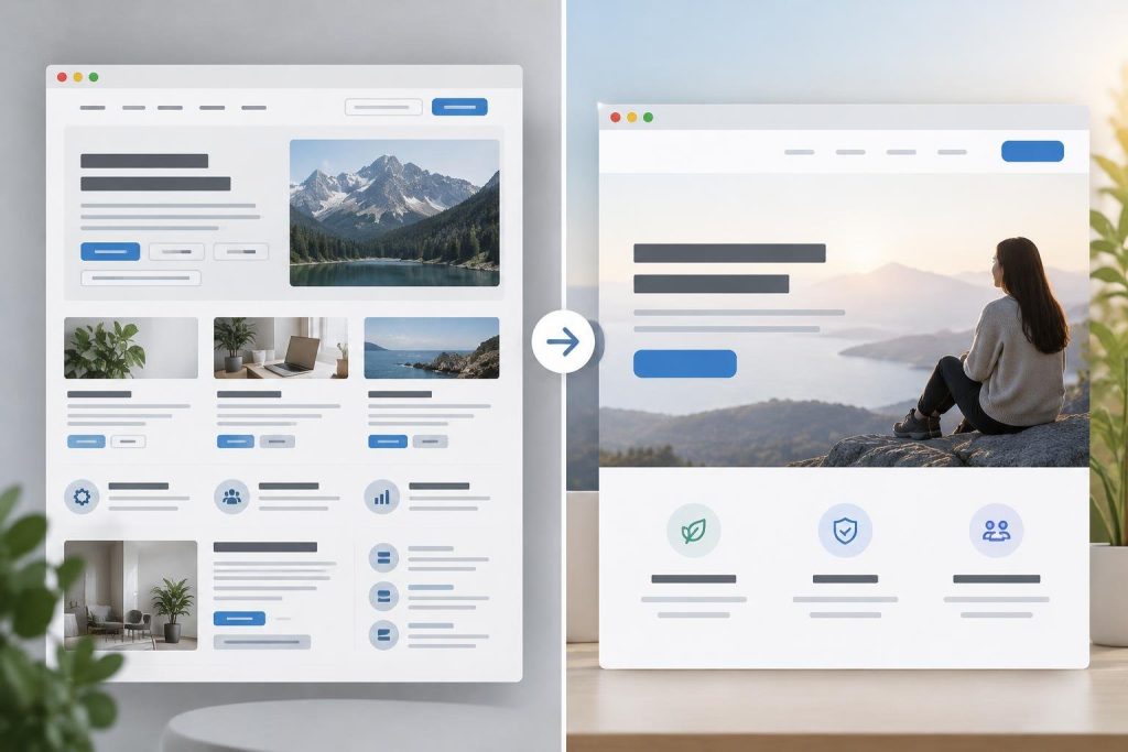
Imagine a typical “before” hero section on a small business site:
- Headline: “Welcome to Our Website”
- Busy background image with no clear focus
- Three equal buttons: “About Us,” “Blog,” “Services”
- No clear statement of what the business actually does
- No trust signals, no mention of benefits
Now here’s how a simple “after” wireframe could look, using the ideas in this article:
- Headline: “We help homeowners keep their yards beautiful with reliable weekly lawn care.”
- Subheadline: “Serving the Westside area with affordable mowing, trimming, and seasonal cleanups since 2015.”
- Primary CTA button: “Get a free lawn quote”
- Trust cue: Small text under button: “Trusted by 300+ local homeowners” and a short 1-sentence testimonial.
- Image: Photo of a neatly mowed yard with a friendly worker in the background.
Same business, same services—but now visitors instantly know they’re in the right place and see a clear next step.
Quick Above-the-Fold Checklist
Use this checklist to audit or tweak your existing hero section.
- My headline clearly states what I offer and who it’s for.
- My subheadline adds helpful detail in one or two sentences.
- I have one primary CTA button with specific action text.
- My image supports the message instead of distracting from it.
- I include at least one trust cue near the CTA.
- On mobile, the hero is easy to read and tap without zooming.
- Nothing important is hidden behind pop-ups or sliders.
- The page loads quickly, especially that first screen.
Do I need to redesign my whole site, or just the hero section?
Often, improving just the above-the-fold hero section can make a noticeable difference in engagement and conversions. Start there: clarify your headline, simplify your CTAs, add a trust cue, and check mobile. If your analytics improve—lower bounce rate, more clicks—then you can gradually apply the same clarity and focus to the rest of your pages.
How often should I update my homepage hero?
You don’t need to redesign constantly, but it’s healthy to review your hero every few months. If your offers, prices, or audience change, your hero should reflect that. You can also A/B test small tweaks—like headline wording or button text—to see what resonates best.
Bringing It All Together
Your above-the-fold section doesn’t need to be fancy. It needs to be clear. A straightforward headline, one obvious next step, supportive imagery, and a hint of proof will outperform a visually impressive but confusing hero almost every time.
Set aside 30–60 minutes to compare your current homepage hero against the checklist in this post. Make small, focused improvements, then watch how visitors respond. Over time, pair a clear, conversion-minded hero with fast, reliable hosting—whether that’s with Webasen or another provider—and you’ll have a homepage that not only looks good, but actually works for your business.